Showing posts with label Furniture Re-do's. Show all posts

Monday, November 5, 2012

A Shabby Chic Bed Makeover


I've been focused on my Etsy shop and just life in general these past couple of weeks, so I don't have anything new to blog about yet, BUT...the other day I realized I have never shared my daughter's bed makeover here on this blog.  It was one of the first makeovers I did for her room and I shared it on our family blog last year, but hadn't posted it here since I started this one.


This is what her room looked like for her first few years of life.  

It was adorable and I loved it, but as she got older she was outgrowing the nursery decor and needed an updated room.  She love love loves the color pink and I eventually decided to go with a Shabby Chic theme that could grow with her for a few more years.


In my "hunting and gathering" phase of getting ready for this room makeover, I searched and searched Craigslist and thrift stores for the perfect bed. But it was so hard! Everytime I thought I'd found the perfect one either it was already sold, the seller never responded to my inquiry, or it was too expensive. Then I came across this one that an acquaintance was selling. I almost passed it up without a second glance thinking it was not a pretty sight.  But then I pictured it white, shabbied up, and with a little extra detailing to make it more feminine and realized that underneath that dark wood ugliness, it really did have great lines. Perfecto! At last I'd found a bed for her.
(Notice that original beadboard  we had in that house?!?  I miss it SO much!)


I sanded it down a bit, bought a $4 scrolly thing (that's the technical name) and epoxied it on. This was when we still lived on the ranch in Florida, so our nosy horses had to check it all out, sniff it, bite it, and knock it over while I was trying to prime it.  (I miss them SO very much too!)


All primed, but not yet "shabbied" up.


And here it is after some distressing with sandpaper. I decided I didn't necessarily want it to have a "discolored" aged look, so I didn't glaze it. I wanted it to be white and just have a shabby/chippy look, but I still wanted to emphasize the details in the scrolly thing a bit more. So I used a very fine paint brush with some black paint and filled in the lines here and there to make it stand out more.


Once we got moved into our current house I got all the bedding ordered and we were able to put it all together finally.  It was the perfect fit!


So that was my first furniture makeover for her new big girl Shabby Chic room.

I'm still trying to get more Etsy stuff done, but I'll be back again soon, I promise.  


Sharing over at:

Thursday, April 12, 2012

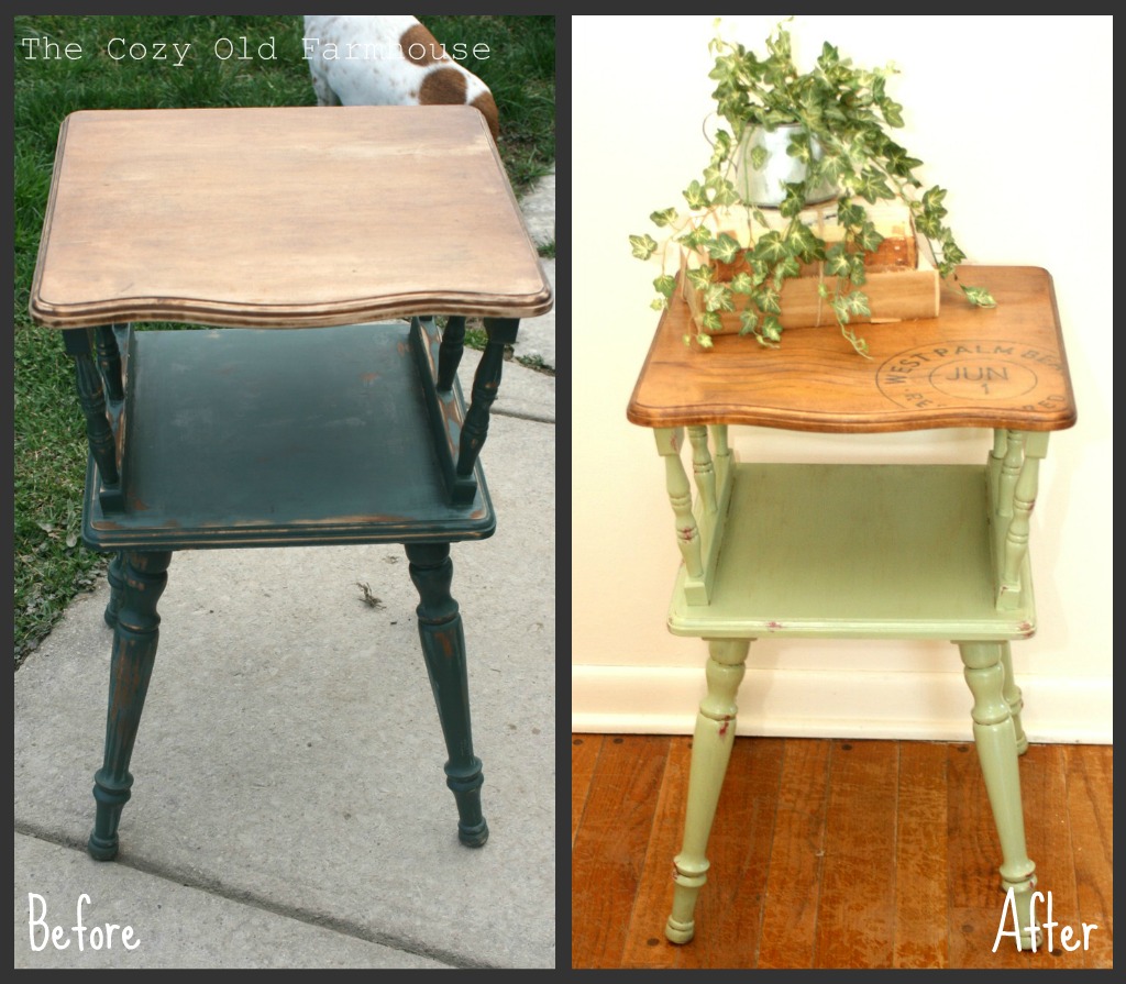
Vintage Table Makeover & a Transparency Transfer

This little thing has been a beast and has taken me forever to complete.  I'm gonna spare you the boring details and just give you the abridged version. 

Somehow the "before" picture got lost, but I got this at Goodwill for $3.  This picture is close to the before, it was taken after I sanded it down a bit.  So just imagine that the top was darker and the 90's style forest green paint was a whole lot thicker and gloppier. 


My original plan for the table was to paint it red and use it in our master bedroom, so I did a primer coat since red paint is notorious for being difficult to work with.


You're probably thinking that it looks pretty good in white aren't ya?  I know I know, but that would have been SO predictable, and though it would have been beautiful (and popular), it's just not me.  (I never was one of the popular kids)  : )

Part way through this makeover I changed my mind on where it would be used and thus what color it would end up.  I did a layer of a light green (an "oops" can bought from a local paint store) and then I randomly splotched some red around so that it would end up with a layered look.


I didn't take more pictures of the painting, but I did a second layer of green and finished it off with an antiquing glaze.

Now for the top of the table.  I had a "vision" for this table, I wanted it to have an old postage mark type emblem in the corner.  The problem was that after I decided this all of a sudden I started seeing tons of tables and projects done with the French postage mark found at The Graphics Fairy.  Again, I didn't want to be predictable and I didn't want to copy what everyone else was doing.  So I went searching for some other, non-postmark, image to transfer but found nothing I liked.  I kept coming back to my original idea.

I finally decided to go with it, but with my own twist to it.  Paris has no meaning to me so I didn't want to use the image from Graphics Fairy.  A Google image search brought up nothing useable.  So....I decided to design my own, one with a little more personal meaning. 


Months ago I had read about transparency transfers on Red Hen Home and thought they sounded like a great idea.  I never was inspired to try the freezer paper, Mod Podge, or Citra Solve transfers because they just sounded too confusing and the results seemed to be iffy.  But the transparency sounded like it would be easy enough and since the "paper" your working with is clear you can see exactly where you're placing your image.   HINT: a box of transparencies at an office supply store will run ya $35-$60 depending on which kind you get!  Instead, you can go to the copy center there in the store and ask to buy individual sheets.  3 of them cost me $1.28.

The idea is that running the transparency through an ink-jet printer gives you an image with ink that's sort of sitting on top of the "paper."  So you slightly dampen the wood you want to transfer it to then lay your image (printed in reverse/mirror image) onto the damp wood and press it down, thereby transferring the now wet ink to your project.  (Check out Red Hen Home for a more detailed tutorial)

I found an extra piece of wood in the garage to do some practice runs on.  


Good thing I did because my first try ended up in a big smeary mess!  The wood was too wet and I pressed too hard.  The half image to the left turned out better after I let the wood dry for a minute before placing the transparency on it.  Then I practiced putting stain over it to make sure it wasn't going to smear my image.  Since the stain is oil-based it didn't affect it at all.


I also experimented with applying the stain first and then putting the image on top, but that didn't work.   See how the ink dotted up?  It wouldn't soak through the oil based stain.


On this one I tried sanding the image a bit before staining, but it ended up looking smeary.  I don't know if the ink just needed to dry longer or if it's just not a good candidate for sanding.  In the end I decided not to risk it and didn't sand my image.


So, here it is after the transfer is complete, but before I stained it.


And here it is all finished up.......finally!


A coat of clear wax will give the top a little extra protection.


Here you can see the layering effect with the red paint.


And the touch of antiquing glaze in the cracks and crevices.


This little thing sat for months and when I finally decided to tackle it, it took much longer than anticipated, but........I'm happy to have it done.  Total cost was around $5.


So, now that I have this project complete, I can show you why I changed my mind about what to do with it and what I did with the  farmhouse lamp.  That'll be up next.


**Update** - if you'd like to see what I did with the table you can see that here: A Cozy Little Kitchen Corner


Friday, September 9, 2011

Turnin' Yella Ain't Always a Bad Thing

I bought this wooden trunk at half price for $45 about 9 years ago.  It has served various purposes over the years, but for the last 3 it's been used as our coffee table.  At first glance you might think it doesn't look too bad with the old, white chippy look, which is what orginally drew me to it.

BUT......after many years of staring at it, it's flaws became more glaring and I decided to redo it.

From what I can tell, it was originally wood with a typical finish.  Then someone came along and painted it brown...a terrible shade of brown, without removing the finish first.  So eventually these lovely little knot holes began to eat through the paint all over the trunk.


Then someone else came along and tried to salvage it by white-washing it (without removing the hardware first) and I'm assuming added a coat of poly that eventually turned yellow.


Drippy poly that aged to an awful, bodily function color of yellow.


I also didn't care for the cross pieces on the top.  They add some character and visual interest to it, but I found it really difficult to decorate because it seemed too sectioned off, and nothing could ever sit flat.  Plus, the wood pieces weren't spatially even and that drove me nuts.

See how this is the only side that goes all the way to the edge?  Why?  Again....drove me nuts!


So, my hubster helped me out by removing the cross pieces (they drove him crazy, too, because whenever he put his feet up on it to relax, they were always in the way).


Here it is all stripped down, sanded, and ready for primer.  Removing the extra wood pieces left some pretty deep gouges, a little more "character" than I wanted, so I filled those in with wood putty before I sanded it down.

(The wood looked kind of pretty and we considered not painting it, but in the end I decided it would have needed a lot more sanding/stripping for that and that was more work than I wanted.)


I gave it two coats of Krylon primer to help seal in those knot holes and cover up the bits of remaining paint that wouldn't budge.


I bought a quart of paint at the Restore that I thought was going to be the perfect shade of yellow,  but when I tried it out on a test piece it literally looked pukey.  I didn't feel like spending money on more paint, so I mixed my own and hoped for the best.


I used Krylon Satin White as the base and dumped in a few partial containers of yellow craft paint and a bit of brown to warm it up.


After two coats of yellow I began to glaze it..........and it was a disaster.  Looked awful!  Thankfully I still had enough paint left to give the whole thing another light coat of yellow so I could try again.  Later I figured out my rag to remove the glaze should have been damp...what a difference that made!


I bet you didn't even notice the carved details in the before pictures, did ya?


I love how the antiquing picked up all the imperfections.


I had to buy a new latch, the old one got all bent of shape (literally) during the removal of the top pieces.  It was bright shiny, gold brass.  So I sprayed it, and the hinges, with Oil  Rubbed Bronze and touched up the edges with Rub-n-Buff Spanish Copper to give it a more aged look. 


I think the Rub-n-Buff added just the right touch, I love it!


I've always loved the combination of farmhouse red/sage green/ and butter yellow.  It just appeals to my sense of comfort.  So I am loving the extra touch of color!


So here it is again......


Before 


After


It was a lot more work and time consuming than I had anticipated, but isn't everything in life?  It ain't perfect, but I'm pretty happy with it.


Linking up to:


Related Posts Plugin for WordPress, Blogger...